CSS Flexbox Layout module

What is Flexbox?
The flexbox is a flexible box designed to build one-dimensional layouts in CSS. One-dimensional means flexbox can build a layout in one dimension at one time. For two-dimensional layouts, use CSS Grids that can handle both rows and columns.

A flexbox layout consists of a flex container (display: flex) that contains a flex item. Flex containers can be aligned horizontally (flex-direction: row or row-reverse ) or vertically (flex-direction: column or column-reverse ).
The direct children of a flex container are aligned along the main axis. These children can “flex” their sizes, growing to fill unused container space, or shrinking to avoid overflowing.

The flex container properties are:flex-direction| flex-wrap|flex-flow | justify-content| align-items| align-content
Flexbox Elements
To start using the flexbox model you need to define a flex container(display: flex).
Direct child elements of the flexible container automatically become flexible items.
Follow the code below, we will explore every property of flex
<!-- HTML CODE -->
<div class="container">
  <section class="flex-container">
    <div class="flex-item flex-item-1"> flex-item-1 </div>
    <div class="flex-item flex-item-2"> flex-item-2 </div>
    <div class="flex-item flex-item-3"> flex-item-3 </div>
    <div class="flex-item flex-item-4"> flex-item-4 </div>
    <div class="flex-item flex-item-5"> flex-item-5 </div>
  </section>
</div>
/* CSS CODE */
* {
padding: 0;
margin: 0;
box-sizing: border-box;
}
html,
body {
height: 100%;
width: 100%;
}
body {
background-color: #eeeeee;
color: #263238;
padding: 60px 0;
}
.container {
width: 80%;
margin: 0 auto;
}
.flex-container {
display: flex; /* or inline-flex */
}
.flex-item {
width: 300px;
padding: 40px 80px;
margin: 10px;
text-transform: capitalize;
background-color: #4a148c;
color: white;
}
Parent Element (Flex Container)
In our code flex-container is the parent container. Parent container property contains :
display| flex-direction|flex-wrap | flex-flow| justify-content| align-items| align-content
display
This defines a flex container; inline or block depending on the given value. It enables a flex context for all its direct children.
.flex-container{
  display:flex; /* inline-flex */
}
flex-direction
The flex-direction decides in which direction the child element of flex-container should flow (horizontal or vertical). By default, it is row(a horizontal direction).
/*update the flex-container class in your css */
.flex-container{
  display: flex;
  flex-direction: column;
}
/*Try other flex-direction values:*/
flex-direction: row|row- reverse|column|column-reverse|initial|inherit;
flex-wrap
The flex-wrap: wrap the value specifies that the flex items will wrap if necessary.
//Add this property to your flex-container class
.flex-container{
  ...
  flex-wrap: wrap;
}
/*Try other flex-wrap values: */
flex-wrap: no-warp |wrap |wrap-reverse;
flex-flow
The flex-flow property is a shorthand property for setting both the flex-direction and flex-wrap properties.
.flex-container {
  ...
  flex-flow: row wrap;
}
justify-content
The justify-content property is used to align the flex items. Its default value is flex-start . Below we have used value center
/*update the flex-container class in your css */
.flex-container {
  ...
  justify-content: center;
}

/*Try other justify-content values:*/
justify-content: flex-start | flex-end | center | space-between | space-around | initial | inherit;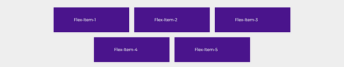
align-items Property
The align-items property is used to align the flex items vertically
// Add this property to your flex-container class
.flex-container {
  ...
  align-items: center;
  background-color: black;
}
/*Try other align-item values: */
align-items: stretch | center | flex-start | flex-end | baseline | initial | inherit ;
align-content
The align-content the property specifies how flex lines are distributed along the cross-axis in a flexbox container.
In the flexbox layout, the main axis is in the flex-direction (default is 'row', horizontal), and the cross axis is perpendicular to the main axis (default is 'column', vertical).
Tip: Use the justify-content property to align the items on the main axis (horizontally)
// Add this two property to your flex-container class
.flex-container{
  ...
  height: 800px;
  align-items: flex-start;
}

Flex Child (flex-items)
The flex item properties are:flex-grow| flex-shrink|flex-basis | flex| align-self| align-self| order
flex-grow
flex-grow specifies how much the flex-item (child) would occupy the space available in its flex-container (parent).
Its default value is 0, considering all the flex-item haveflex-grow 1 then the available space will be distributed equally.
If one of the flex-item has a value of 3, that child will take up thrice as much of the space if available.
.flex-item-3{
    flex-grow: 1;  //other values 2,3,4,..n
}
flex-shrink
flex-shrinkspecifies how much the flex-item (child) would shrink compared to its sibling.
 <section class="flex-container">
    <div class="flex-item flex-item-1"> flex-item-1 </div>
    <div class="flex-item flex-item-2"> flex-item-2 </div>
    <div class="flex-item flex-item-3"> flex-item-3 </div>
    <div class="flex-item flex-item-4"> flex-item-4 </div>
    <div class="flex-item flex-item-5"> flex-item-5 </div>
</section>.flex-item-3{
flex-shrink: 0;
}Please update your code accordingly.

flex-basis
flex-shrink define the length of the element. Values can be 200px, 20rem, 20%,etc or auto . Update your stylesheet accordingly.
.flex-item {
    /* width: 300px; */
    flex-basis: 400px;
}
.flex-item-3{
    flex-basis: 250px;
}
flex
flexis the shorthand property of flex-grow,flex-shrink, andflex-basis.

order
By default, the flex-items are displayed in source order, but by using the order property we can change its display order in flex-container.
.flex-item-1 {
    order: 5;
}
.flex-item-2 {
    order: 4;
}
.flex-item-3 {
    order: 3;
}
.flex-item-4 {
    order: 2;
}
.flex-item-5 {
    order: 1;
}


